In the world of digital content, resolution isn’t just a technical setting—it’s the difference between crisp visuals and blurry disappointments.
In 2025, with creators juggling everything from social posts to print materials, understanding resolution and DPI (dots per inch) is non-negotiable. Yet, many still misunderstand what DPI really means—and when it actually matters.
The good news? Once you crack the code on resolution, you can consistently produce visuals that look sharp, professional, and platform-ready.
Here’s how to stop guessing and start using the right resolution for every project.
1. Resolution and DPI Are Not the Same Thing
People often use resolution and DPI interchangeably—but they’re not the same.
- Resolution: Refers to the total number of pixels in an image (e.g. 1920×1080 pixels).
- DPI (Dots Per Inch): Refers to the print density—the number of ink dots per inch when an image is printed.
Action Step:
- Remember: Resolution impacts digital clarity. DPI impacts print quality.
- If your content is staying on a screen, DPI is irrelevant.
Common Mistake: Increasing DPI does not automatically make a low-res image sharper.
2. The Myth: “Higher DPI = Better Quality” (Not Always)
Many creators believe that cranking DPI up to 300 will save a bad image. It won’t.
A 72 DPI image at 1920×1080 pixels and a 300 DPI image at 1920×1080 pixels have the same amount of digital information—the difference only shows up when printed.
Action Step:
- For digital use: Focus on pixel dimensions (e.g., Instagram post at 1080×1350 px).
- For print: Use 300 DPI or higher to maintain sharpness.
Pro Tip: Upscaling a low-res image to 300 DPI won’t magically improve it. You need high-resolution source files from the start.
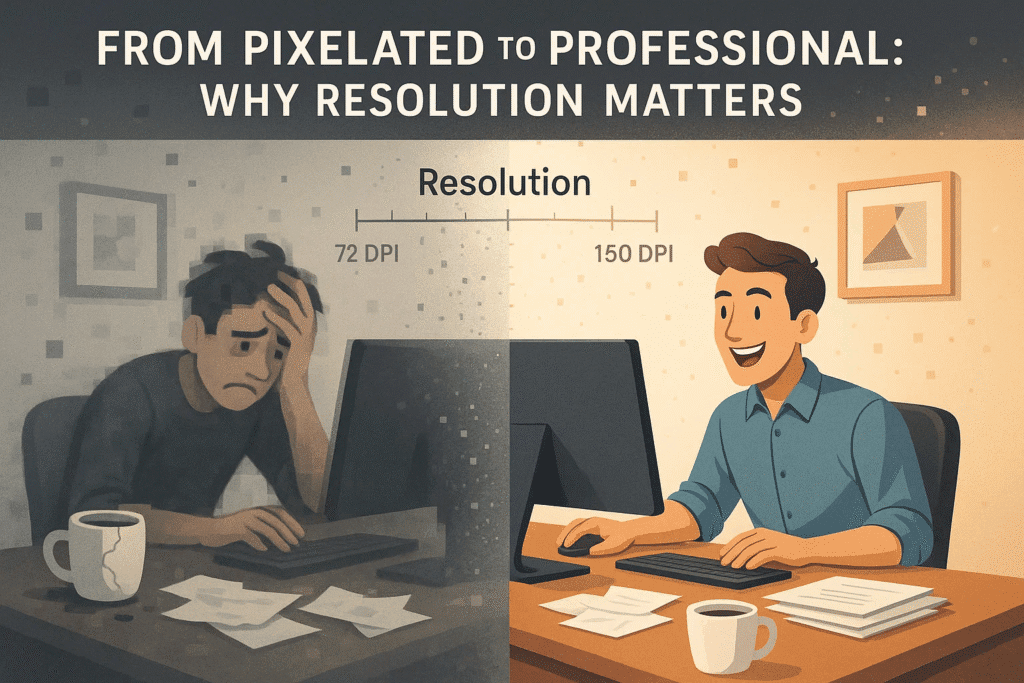
3. When to Use Common DPI Settings
Different platforms and formats require different resolutions. Here’s a cheat sheet:
| Use Case | Recommended DPI | Pixel Dimensions Example |
|---|---|---|
| Web & Social Media | 72 DPI | 1080×1080, 1920×1080 |
| HD Video | 72 DPI | 1920×1080, 3840×2160 |
| Print (Small Items) | 300 DPI | Flyers, postcards |
| Print (Large Format) | 150–300 DPI | Posters, banners |
| Magazines/Books | 300 DPI | High-detail prints |
Action Step:
- Before starting a project, ask: Where will this live?
→ If it’s print, set up files at 300 DPI from the beginning.
4. Why Low-Res Looks Fine on Screen—Until It Doesn’t
Screens can hide a lot. Your low-res image might look fine on your laptop but will pixelate when scaled or printed.
Action Step:
- Always export social graphics at actual size (no unnecessary upscaling).
- For multi-purpose assets, design at higher resolutions so you can downsize without losing quality.
Stat to Know: 47% of digital creators accidentally deliver assets at incorrect resolutions when repurposing content across platforms (Canva, 2025).
5. File Size vs. Quality: Find the Balance
High-res files come with a tradeoff: larger file sizes. For web, oversized files can slow load times.
Action Step:
- Compress images for web using tools like TinyPNG or Photoshop’s “Save for Web” feature.
- For print, prioritize quality—file size matters less.
Pro Tip: For social, JPEG is usually best for photos, while PNG is best for graphics with text or transparent backgrounds.
Conclusion: Create with Clarity
When you understand resolution and DPI, you stop wasting time second-guessing your exports—and you start producing content that looks sharp wherever it lands.
Your Move: This week, double-check the resolution settings on your next project before you design or export. Getting it right from the start saves you from frustrating reshoots, blurry prints, and underwhelming posts.
In 2025, visual quality isn’t optional—it’s the baseline. Respect the pixel.


